
Red does not always evoke warmth, and blue does not systematically create a feeling of coolness. Intermediate shades like purple or green regularly challenge established references. Decoration catalogs and professional color charts sometimes present different rankings for the same color, depending on the light or environment.
Some spaces gain or lose comfort simply through the choice of a shade, without any physical modification taking place. Color codes directly influence perception, ambiance, and even well-being, beyond personal preferences.
Read also : How to Successfully Extend the Classic Robien Amortization: Tips and Tax Strategies
Understanding the difference between warm and cool colors in decoration
Looking at a room, you can already feel how colors affect our way of inhabiting it. Difference between warm color and cool color: this expression becomes evident for those with a keen eye. On one side, shades ranging from red to yellow, reminiscent of the light of a fire or the energy of the sun. On the other, tones that go from blue to green through purple, all fresh and calm, like a morning mist. But this separation is not limited to simple symbolism: it all relies on the temperature of colors, a key concept in decoration, painting, or even architecture.
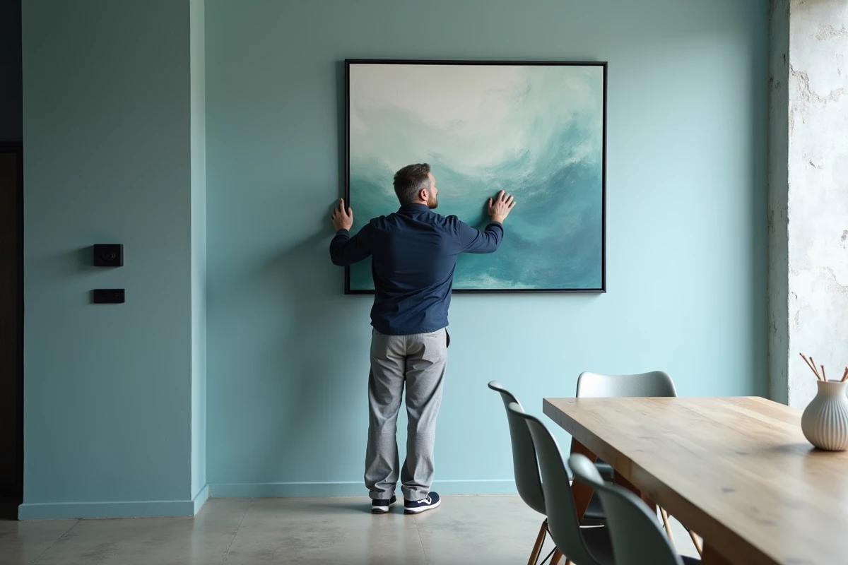
Warm colors, red, orange, yellow, create rhythm, attract the eye, and bring walls closer together. Painting a wall in ochre or terracotta immediately envelops the room, making it more intimate and conducive to conviviality: perfect for the living room or dining room. Conversely, cool colors, blue, green, certain purples, push boundaries, enlarge the space, and promote calm. They transform a bedroom into a restful cocoon, an office into a haven of concentration.
See also : Online Classifieds: How to Buy and Sell Easily on the Internet
To visualize these families, the color wheel remains the key tool. An invisible line separates the two camps. Between them, neutral colors like white, gray, beige, or black act as mediators, serving as a background or point of balance. But light, whether natural or artificial, can sometimes blur the boundary, shading each hue. Historian Michel Pastoureau reminds us: our relationship with colors changes with time, culture, and use. In decoration, the distinction between warm and cool is never set in stone; it varies according to individual sensitivity and perspective.
Why do these colors influence the ambiance and emotions of a room?
As soon as you cross the threshold, color imposes its ambiance. The psychology of colors sheds light on this phenomenon: each hue, warm or cool, triggers sensations and influences the mood of the inhabitants. Warm colors stimulate, warm up, and energize. A brick red on a wall, a bright yellow on curtains, a coppery orange on a cushion: all of this establishes a communicative energy, fosters exchanges and conviviality, especially in the decor of the living room or dining room. In contrast, cool colors, glacier blue, water green, misty purple, create a calm atmosphere, conducive to relaxation and tranquility.
But the effect is not solely due to the choice of hue: it also depends on how the space is perceived. Cool tones visually push walls away, create depth, and open up the horizon. Warm shades bring volumes closer, offer a sense of wrapping, sometimes a cocoon, even reducing the feeling of space. This optical play relies on how our eyes and brains interpret reflected light.
Here, color in decoration does not just play an aesthetic role. It interacts with light, modulates the atmosphere, and shapes our relationship with the interior. Each chromatic choice tells a silent story, imprints a sensory experience that, even discreet, leaves its mark on daily life.
Practical tips for choosing between warm and cool shades based on the desired effect
Creating a color palette for your interior is never a matter of chance. Each room imposes its needs, each activity calls for a particular ambiance. Warm colors, red, ochre, terracotta, mustard yellow, create closeness, envelop, and make spaces more vibrant. For a living room or dining room, they establish a dynamic, structuring the space around a center.
Cool tones, blue, green, pearl gray, soothe, enlarge, and instill softness. They are suitable for a bathroom or a bedroom, inviting relaxation and freshness. For orientation, the color wheel remains a reference: on its right, the warm (yellows, reds), on the left, the cool (blues, greens). Neutral colors, white, linen, gray, allow for connections, avoid saturation, and bring breathing space into the room.
How to combine warm and cool colors?
To achieve harmonious associations, a few simple rules can help guide choices:
- Add contrasting touches through accessories: cushions, rugs, decorative objects bring relief and personality without weighing down the overall look.
- Pay attention to balance: two-thirds for the dominant hue, one-third for accent colors. This ratio avoids visual cacophony.
- Consider the light: in a north-facing room, warm colors compensate for coolness; in a sun-drenched room, cool tones create a soothing breath.
Colorimetry also offers inspiring avenues. Harmonies associated with the seasons, autumn woman, winter woman, spring woman, summer woman, allow for the creation of a custom palette, reflecting each person’s personality. There’s nothing to stop you from daring, modulating according to use, and playing with light and volumes. After all, each room is a stage, and color is its living light.